Analytics
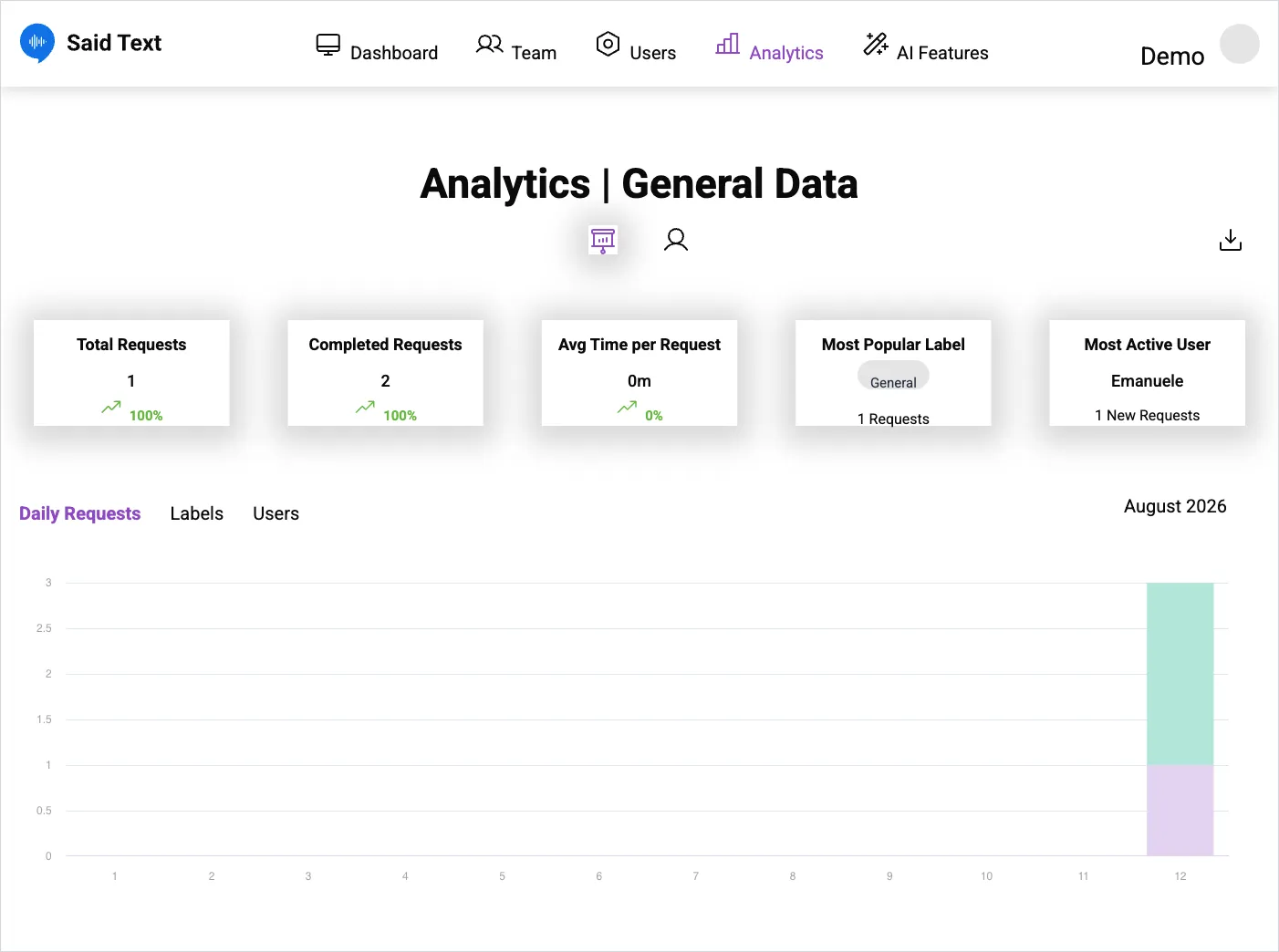
Analytics | General Data gives a summary of activity. The two icons under the title switch between the general view and the per-user view. The download icon exports the data, and the selector on the right sets the month.
The KPI cards
Section titled “The KPI cards”| Card | What it counts |
|---|---|
| Total Requests | Requests in the selected period, with the change on the previous one |
| Completed Requests | How many were closed |
| Avg Time per Request | Average handling time |
| Most Popular Label | The label used most, with its count |
| Most Active User | The requester who sent most, with how many |
The charts
Section titled “The charts”Three tabs below the cards: Daily Requests, Labels, Users.
Reading the numbers honestly
Section titled “Reading the numbers honestly”Percentage changes on small numbers swing wildly — a jump from one request to four reads as +300%, which says nothing about your operation. On low volumes, look at the daily chart rather than the percentage.
Avg Time per Request measures time to closure, so it reflects your team’s habits as much as the work: requests parked In Progress instead of Follow Up inflate it, and requests closed to tidy the board deflate it. See the request lifecycle.
SaidText S.r.l. - VAT IT03035200348